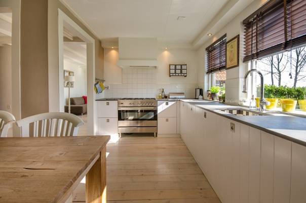
Choosing the right color palette for your kitchen can transform it from a mere cooking space into the heart of your home. A thoughtfully selected color scheme not only enhances the overall aesthetic but also sets the mood and influences how you feel while cooking and entertaining. Whether you’re remodeling your kitchen or just looking for a fresh update, this guide will walk you through the process of selecting the perfect color palette that complements your style and functionality needs.
Understanding the Role of Color in Kitchen Design
Colors have a significant impact on mood, perception of space, and even appetite. In the kitchen, where functionality and aesthetics meet, the color palette you choose can:
- Affect the Room’s Ambiance: Warm colors like reds, oranges, and yellows can make a space feel cozy and energetic, while cool colors like blues, greens, and grays can create a calm and serene environment.
- Influence Space Perception: Lighter colors can make a small kitchen appear larger and more open, while darker colors can add depth and warmth to a spacious kitchen.
- Impact Your Mood: Bright and vibrant colors can invigorate and stimulate, while muted and neutral tones can create a more relaxed and serene atmosphere.
Step 1: Identify Your Style
Before diving into color choices, it’s essential to define the style you want for your kitchen. Your color palette should harmonize with the overall aesthetic of your home. Here are some popular styles and their typical color schemes:
- Modern: Sleek, minimalistic, and often characterized by a monochromatic palette with pops of bold colors. Think black, white, and gray with accents in vibrant hues.
- Traditional: Classic and elegant with rich, warm colors like deep reds, navy blues, and forest greens. Wood tones and antique finishes often accompany this style.
- Farmhouse: Cozy and inviting with a preference for soft, muted colors such as creamy whites, pastel blues, and gentle grays.
- Industrial: Urban and edgy with a mix of neutral tones like steel gray, brick red, and concrete gray. These colors often complement raw materials like metal and exposed brick.
Step 2: Consider Your Kitchen’s Size and Layout
The size and layout of your kitchen play a crucial role in determining the best color palette. Here’s how to tailor your color choices based on these factors:
- Small Kitchens: Light colors like soft whites, light grays, and pale blues can help make a small kitchen feel more spacious and open. Adding a splash of color through accessories or an accent wall can also create visual interest without overwhelming the space.
- Large Kitchens: Darker hues or bold colors can add warmth and coziness to a large kitchen. Consider using rich shades like charcoal, deep navy, or even a bold accent color to create a focal point and make the space feel more intimate.
Step 3: Harmonize with Existing Elements
Your kitchen’s color palette should coordinate with existing elements such as cabinetry, countertops, and flooring. When selecting colors, keep these considerations in mind:
- Cabinetry: If you have wooden cabinets, consider colors that complement or contrast with the wood tone. For example, creamy whites or soft grays can create a fresh look against darker wood, while bold colors can make a statement with lighter wood finishes.
- Countertops: Choose colors that either match or contrast with your countertops. For instance, if you have a marble countertop with gray veining, a soft gray or blue can create a cohesive look. Conversely, a vibrant color can create a striking contrast.
- Backsplash: Your backsplash can serve as a canvas for introducing color. Opt for a color that complements the walls and cabinetry or use it as an opportunity to add a splash of vibrant hues or patterns.
Step 4: Create a Balanced Color Scheme
A well-balanced color scheme incorporates a mix of primary, secondary, and accent colors. Here’s how to achieve balance:
- Primary Color: This is the dominant color that sets the tone for your kitchen. For a classic look, you might choose a neutral shade like white or gray. For something more daring, opt for a bold color like navy blue or forest green.
- Secondary Color: This color complements the primary color and is used in larger areas like walls or cabinetry. Ensure it provides enough contrast to create visual interest without clashing.
- Accent Color: These are the vibrant or contrasting colors used in smaller doses, such as on accessories, appliances, or a feature wall. Accent colors add pops of personality and can be changed easily if you want to update the look without a major overhaul.
Step 5: Test Your Colors
Before committing to a color palette, test your choices in the actual kitchen space. Paint swatches on the walls and observe how they look at different times of the day and under various lighting conditions. Consider how the colors interact with each other and with other elements in the kitchen.
Step 6: Incorporate Trends Wisely
While it’s fun to incorporate current color trends, it’s important to choose shades that you’ll enjoy for years to come. Some of the trending colors that have staying power include:
- Earth Tones: Warm browns, terracotta, and olive greens that bring a natural, grounding feel to the kitchen.
- Soft Pastels: Gentle pinks, blues, and greens that create a calming and fresh atmosphere.
- Bold Blues and Greens: Deep shades that add drama and sophistication while remaining versatile.
Featured Image Source: https://cdn.pixabay.com/photo/2017/03/22/17/39/kitchen-2165756_640.jpg